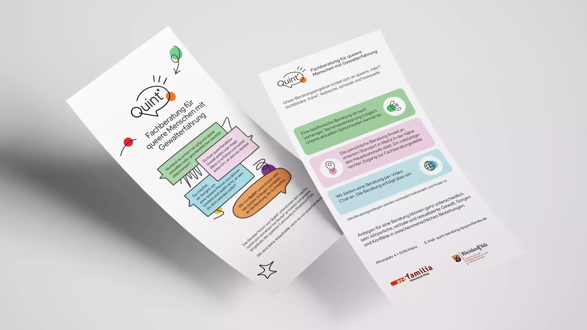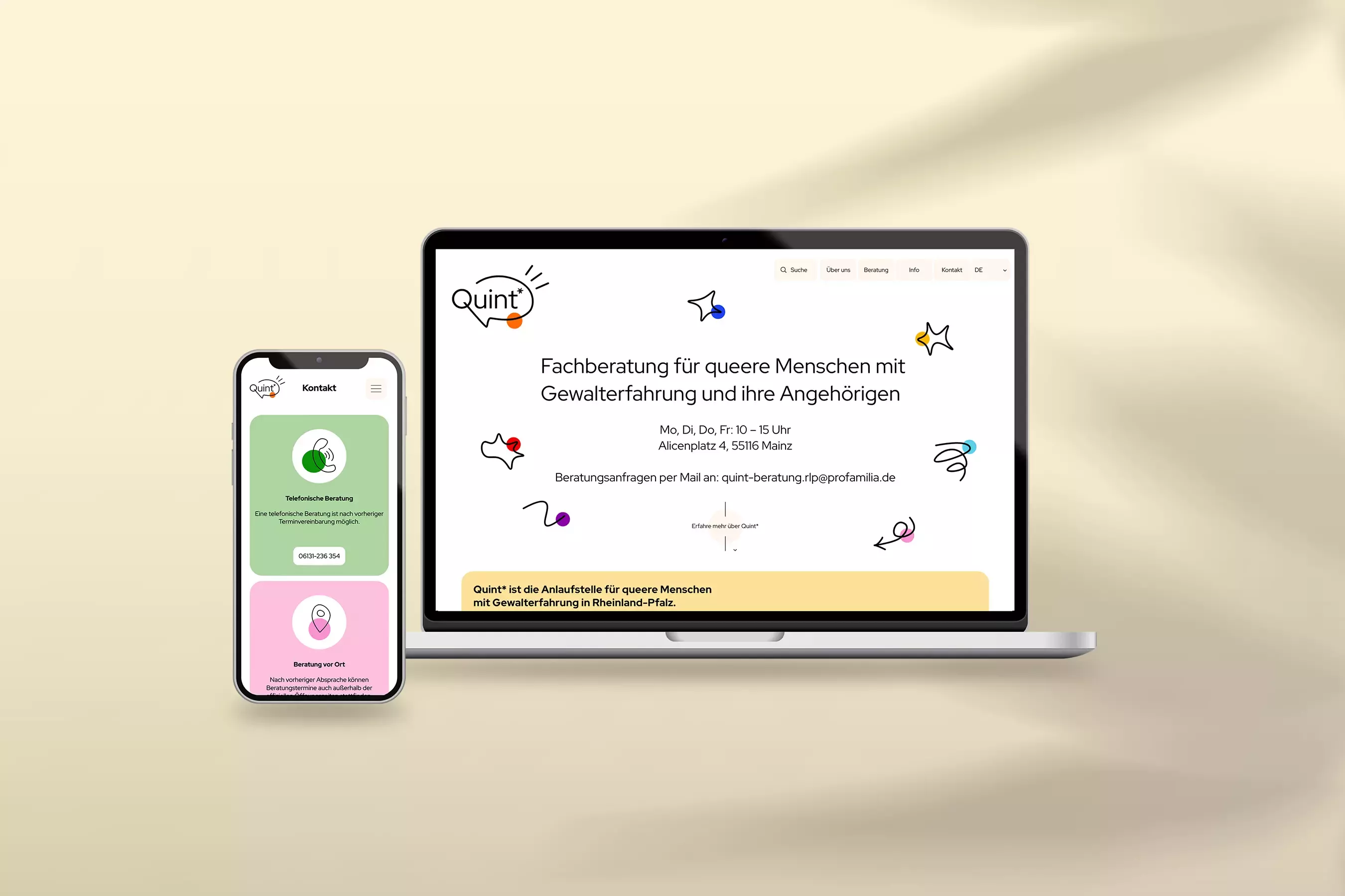
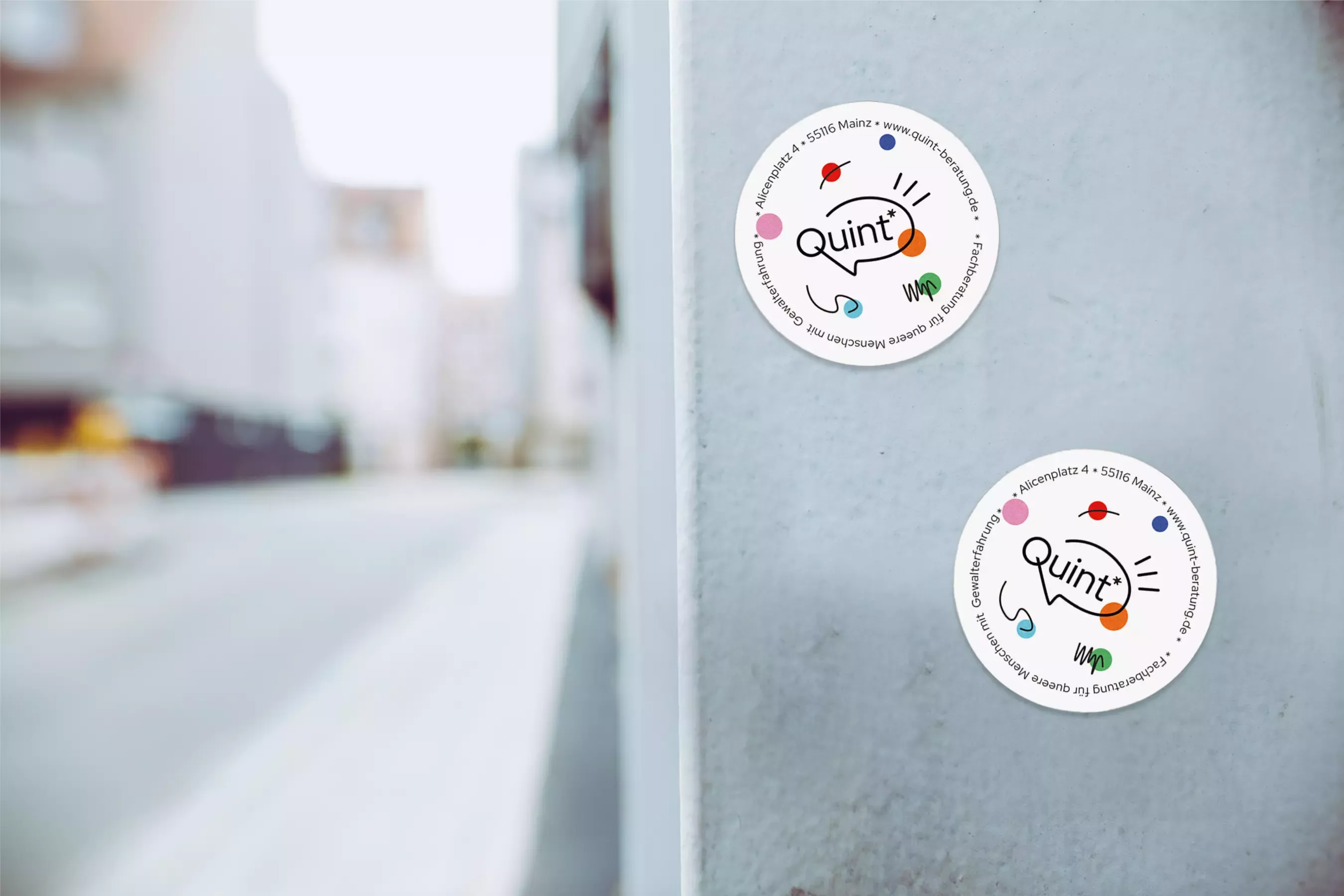
The orange dot in the logo connects to pro familia’s corporate design, creating a visual bridge to the organization. The speech bubble derived from the “Q” frames the name and symbolizes dialogue, support, and advice. Clear shapes and functional typography lend the logo a sense of seriousness, while the round shape emphasizes accessibility and openness.
Design
Sketchy drawings represent the breaks and turning points in the lives of those affected—sometimes unique, sometimes recurring, always individual. Bold, round areas of rainbow colors connect these lines and symbolize the diversity of queer identities. Flowing, directional lines visualize possible ways of dealing with experiences of violence. This creates an image of movement, change, and process—fitting for a counseling center that offers guidance and support.