
Background and objectives
The project is aimed in particular at educational professionals who are increasingly coming into contact with AI applications in their work—whether in communication, media relations, or creative processes. The aim is to promote a positive attitude toward AI while providing practical tips for everyday professional life.
To this end, complex topics such as machine learning, neural networks, and the distinction between “weak” and “strong” AI are presented in an understandable way. In addition, interactive elements such as quizzes and everyday scenarios establish connections to the users’ lives. This creates a low-threshold approach that combines knowledge, reflection, and practical application.
Design
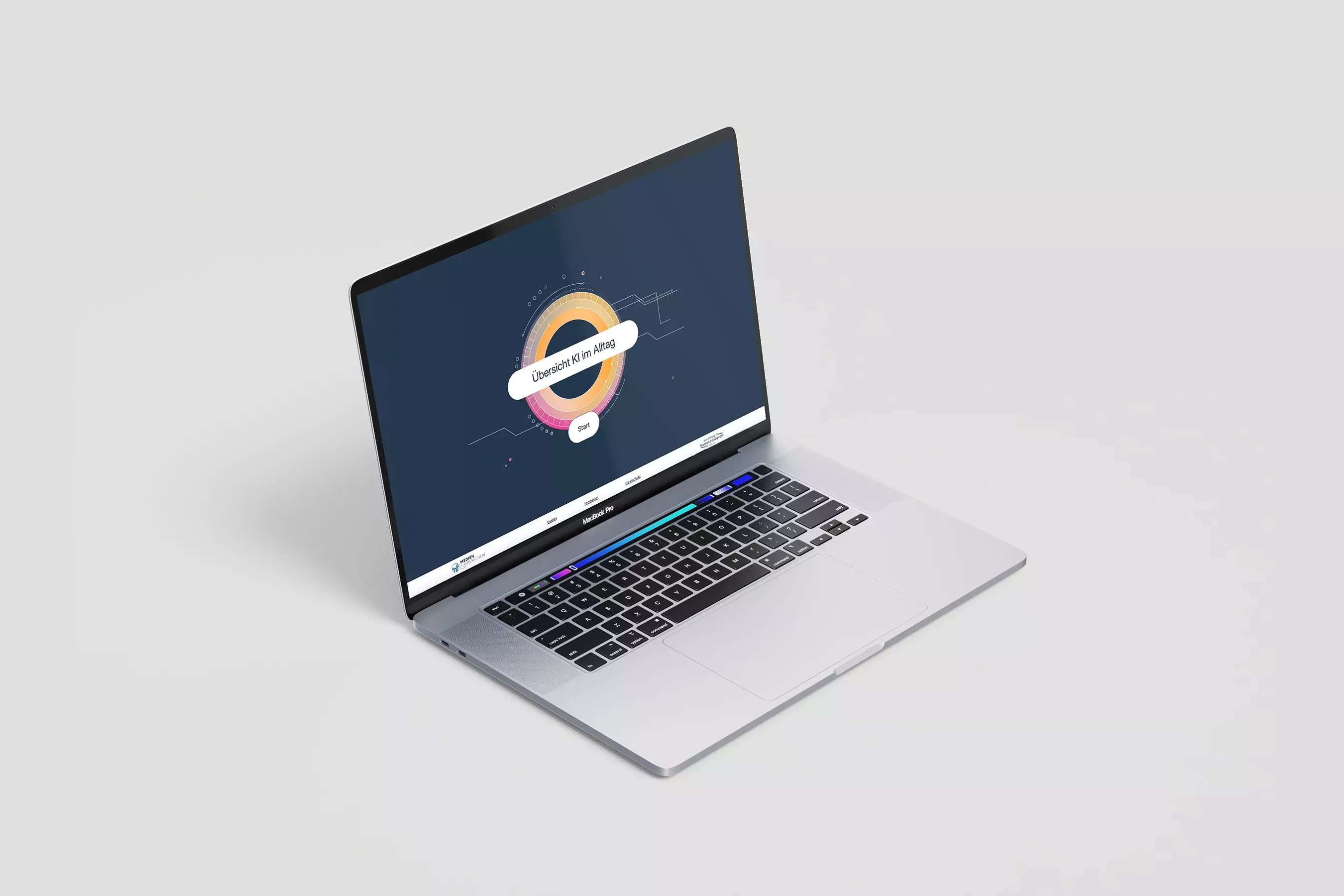
Large illustrations introduce the topics and create visual anchors. Subtle animations accompany the interactions and make the site user-friendly and easy to understand. The clear, responsive layout provides orientation and supports low-threshold access to complex content.
Development
The technical implementation was carried out as a responsive web element based on HTML5, CSS, and JavaScript. Users can access the site on all common devices in an accessible and intuitive manner. At the center is an explanatory video that explains the most important basics in 2–3 minutes. Interactive in-depth information has also been developed to supplement this.